Mahnoor Manzoor

Solo founder · Mobile · Live on Google Play

Halal One

A halal food scanner that explains its answers, instead of leaving people guessing in the supermarket aisle.

Hi, I'm the scan frame. I'll walk you through how Mahnoor built this app. Press anything you can press.

4Months to build
396Design variables
5Madhabs
20Testers in 3 countries
My role
Founder
Team
One designer directing five AI roles: AI Designer, PM, Researcher, Developer, QA
Timeline
June to October 2026
Platform
Android
Tools
  • Claude
  • Claude Code
  • ChatGPT
  • Gemini
  • Figma
  • Figma Make
  • Stitch
  • Supabase
  • GitHub
  • Railway
  • Expo

February 2026

One word in the aisle

I moved to Germany in February 2026. Everything was new, and food was the hardest part. When you are new in a country, you don't yet know which shops and products you can trust. So I did what most of us do. I stood in the supermarket and opened a halal scanner app.

It said “Mushbooh”.

I knew the word meant doubtful, but in that moment it didn't help me at all. Doubtful because of what? Should I put the product back? The app didn't say. None of the apps I tried did.

Be me for ten seconds.

Mushbooh

No reason. That was the whole answer.

Press it all you like. Nobody is answering.

So I stopped using them and asked Gemini instead. That brought a different problem. In a supermarket, you don't have time to explain to an AI how it should answer you. At home I kept researching, and found something worse.

Some products that AI called haram or doubtful were marked halal by scanner apps.

Now I could see the gap.
OptionFast enough for the aisleGives a reason
Scanner appsYesNo
AI chatNoYes
What I wantedYesYes

A clear answer in seconds, with a reason you can check.

I want to be honest about how this started. I didn't run interviews or a survey. This came from my own experience and my own research. Real people came in later, during testing.

June 2026

Decide before you design

I didn't open Figma first. I started with a conversation. I described my idea to Claude and asked for its honest opinion. One thing it said stayed with me: the hardest part wouldn't be the design or the build. It would be the data. I kept that in mind. Testing later proved it right.

Remember that line about the data. It comes back.

AI doesn't write the verdict

It would have been the easy way to build this. But an AI sounds just as sure when it is wrong, and on this topic a confident wrong answer breaks all trust.

  1. Open Food FactsProduct data
  2. Ingredient databaseThe view of each madhab
  3. The verdictComes from those two
  4. AIOnly answers the questions people ask afterwards
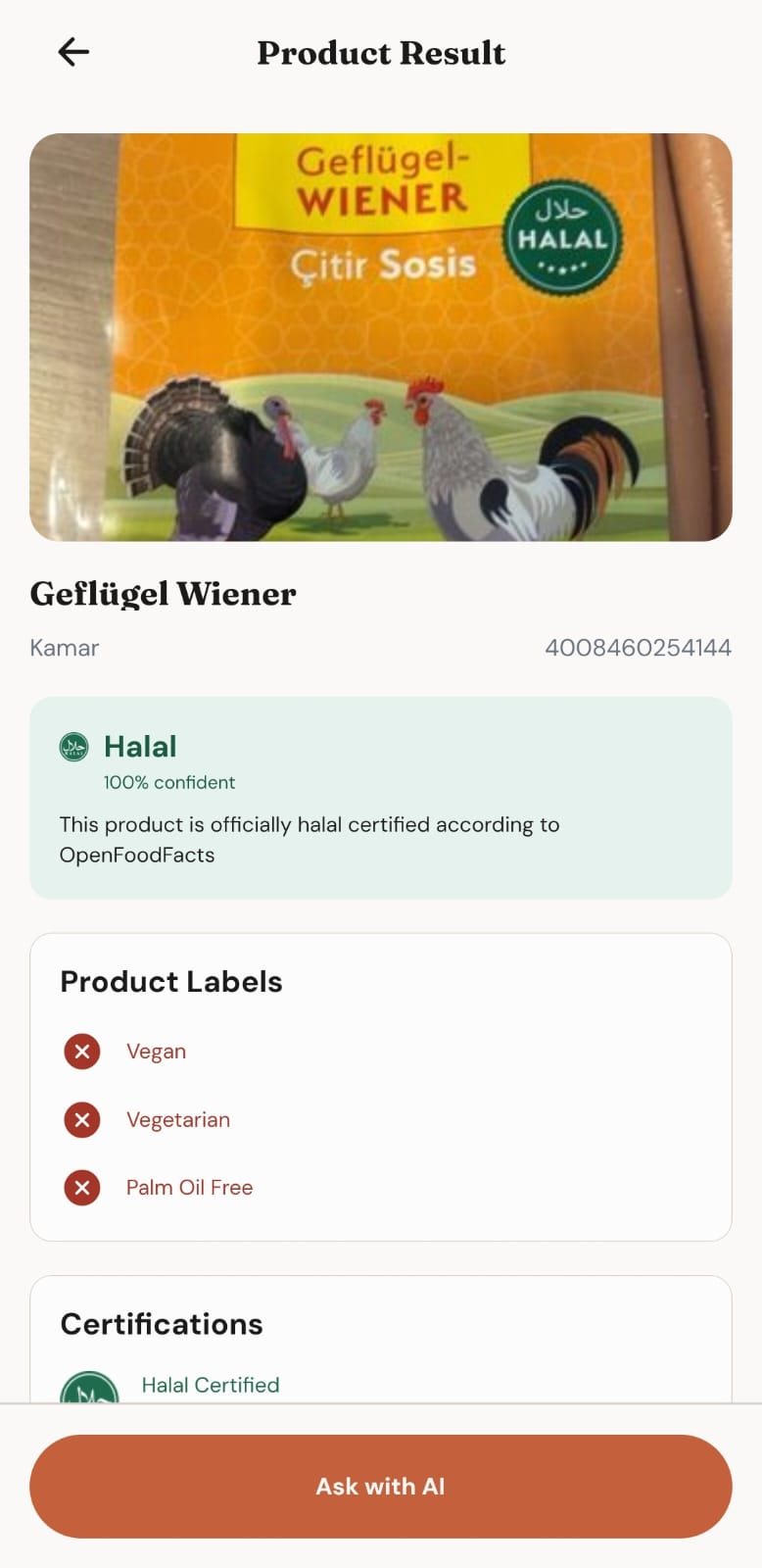
Four honest answers, not just yes or no

“Doubtful” had to stop being the end of the conversation, so it tells you why and how to check. “Scholars Disagree” shows which madhabs disagree and why, so you can follow your own school.

Product result marked Halal, with the reason shown under it
No problematic ingredients found, or certified halal. The screen says which.
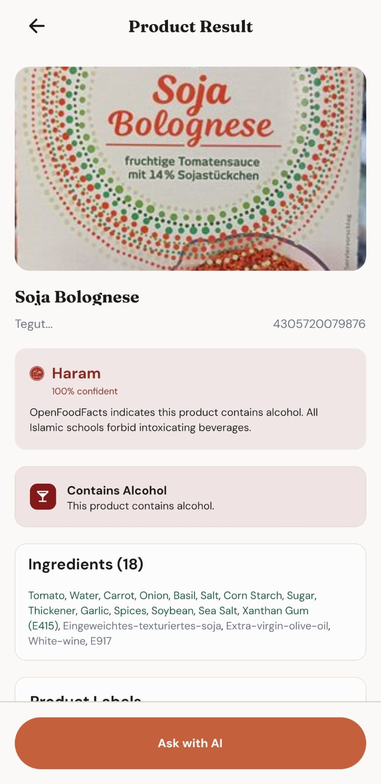
Product result marked Haram, explaining the product contains alcohol
Contains an ingredient the madhabs consider forbidden, and the screen names it.
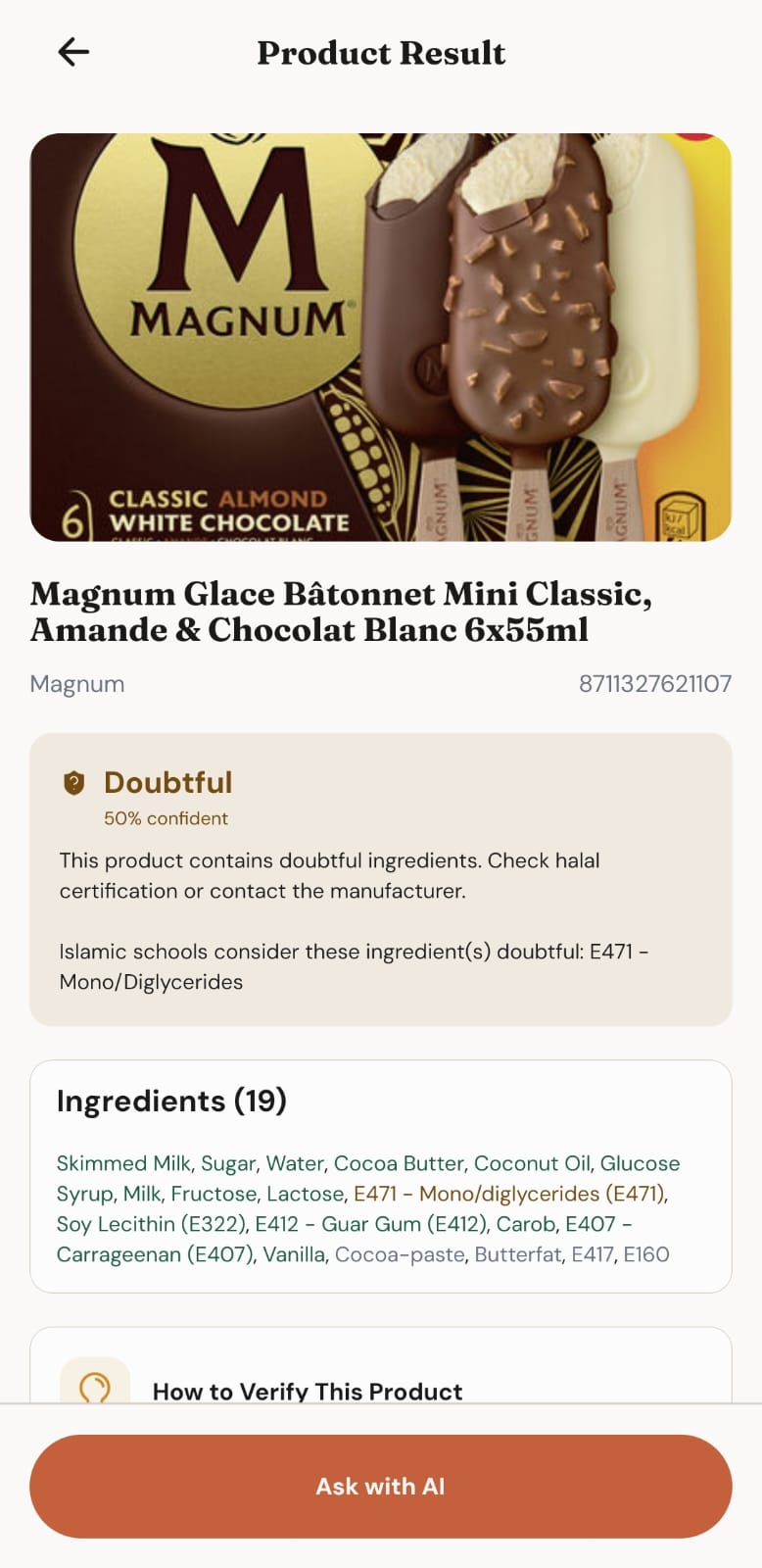
Product result marked Doubtful, naming E471 as the doubtful ingredient, with how to verify the product
The word I wanted explained. Now it says what is unclear and how to verify it.
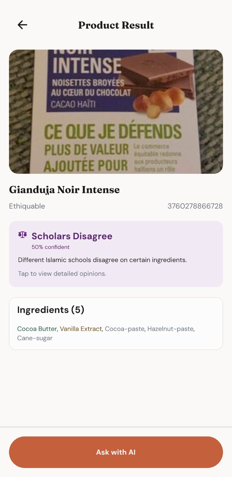
Product result marked Scholars Disagree, with a prompt to view detailed opinions
The madhabs don't agree, so the app says so instead of choosing for you.

Who was missing?

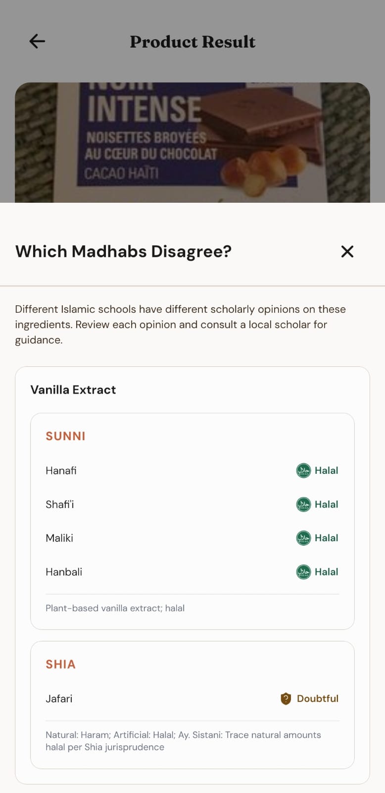
I started with four madhabs: Hanafi, Shafi'i, Maliki and Hanbali. During development I realised my app was only showing Sunni schools. There are Shia Muslims too, and most of the apps I had seen follow Sunni schools only.

  • Hanafi
  • Shafi'i
  • Maliki
  • Hanbali
  • Ja'fari

So I added the Ja'fari school. I researched that school and which ingredients it permits and which it doesn't, then updated the database with it. Halal One launched with five.

Nobody asked for this one. She just noticed who wasn't there.

Which Madhabs Disagree sheet listing Sunni and Shia views on vanilla extract

Then the user flow

From that conversation came a PRD, and from the PRD a user flow. Answer the questions to walk through the core of it.

  1. App launch
  2. Home
  3. Scan barcode
  4. Barcode detected?
  5. Enter the barcode by hand
  6. Look up the product
  7. Product found?
  8. Product Not Found, scan another product
  9. Verdict and full ingredient list
  10. Which verdict?
  11. Done, safe to buy
  12. Ask with AI, from the same page
  13. A short, to-the-point answer from AI
  14. Tap the verdict card
  15. See what each madhab says
  16. Follow your own school

July 2026

A foundation in one hour

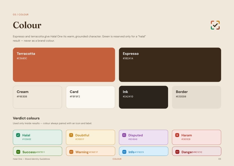
Next I worked with Claude on brand colours and fonts. We settled on terracotta and espresso, and green got one job only: meaning Halal. Then Claude worked inside my Figma file through the Figma MCP to build the brand identity, while I directed it, reviewed every frame and corrected it until it was right. The AI did the clicks. The decisions were mine.

396 variables in 5 collections, wired into the components.

  • 172Primitives
  • 61Aliases
  • 105Mapped
  • 30Layout
  • 28Type

Three layers, so one change is enough

A button never holds a colour. It holds a token, and the token points at a step on the scale. Press a step and follow it through.

50 is the exact brand colour.

  1. terracotta / 50The raw colour
  2. button / primary-containerWhat it is for
  3. ButtonThe componentUses the token, never the raw colour

For the design system, I gave it the Checklist Design design system checklist as a reference for building the components with their documentation, and told it: “Don't copy and paste just follow the pattern of clean, minimal, organized, and structured.” Then came the foundation, and then components one by one, starting with buttons.

These are her real Figma frames. Pick a page, then press a frame to see it full size.

Halal One, the Figma file

Foundation

Components

More component pages, not shown here

Brand Identity

What it is

Colour, type, the meaning behind the mark, and which pairings are readable. The system starts here.

What I decided

Green appears only in the Halal verdict, never as a brand colour.

Primitives

What I asked

In primitives: I want to add all colors from brand and create their light and dark shades on a scale from 0 - 100. 50 would be the actual color on the brand identity page.

Example prompt, not my exact wording

What it is

172 variables. 13 steps per hue. Never used directly in designs.

Aliases

What I asked

I want to build a design system in three groups: Brand Primitives Colors, Aliases, and Mapped.

Example prompt, not my exact wording

What it is

61 semantic tokens for surface, text, border, brand, feedback and verdict. Each has a Light and a Dark value pointing at a primitive step.

Mapped

What it is

105 component-level tokens for buttons, inputs, cards and the tab bar.

What I decided

Components use aliases only, never a raw hex. That is what makes one change enough.

Type and spacing

What it is

A mobile type scale in Fraunces and DM Sans, and a 4-point spacing scale with touch targets. 58 more variables.

Iconography

What I asked

And create components in atoms, molecules, and organisms so that if I have to change the master component of anything it would be changed in all files.

Example prompt, not my exact wording

What I decided

I didn't like the first iconography, so I had it redone against a proper checklist.

Buttons

What I asked

Create the buttons on their own page, with every type, state and size as variants. Use only the foundation tokens, and add the accessibility notes on the same page.

Example prompt, not my exact wording

What it is

5 types, 6 states and 3 sizes, every state tokenised, with its accessibility notes on the same page.

Cards

What I asked

Now create a different page. And create all components of cards with variants by following the checklist from Checklist Design

Example prompt, not my exact wording

What it is

6 card types, 3 elevation levels and 3 states. Inputs, selection controls and mixed components got their own pages too.

MVP Screens (version 0)

What I asked

Use ONLY my existing design system.
Create the page structure only.
Do not design the individual rows yet. Focus on spacing, hierarchy and Auto Layout.

Example prompt, not my exact wording

What I decided

Structure first, details after, and nothing from outside the system. Every screen of the app, built on those variables.

Go on, press everything. I'll wait.

Type
State
Size
Button

5 types, 6 states, 3 sizes. Try them all, the way I checked them.

The brand identity and foundation took about an hour. In my previous jobs there was no design system, so I made small pieces just for myself, and I knew how slow that work was. Done properly, this takes a team weeks or months.

But I don't accept work just because it was fast.

I didn't like the first iconography, so I had it redone against a proper checklist, built as atoms, molecules and organisms, so that changing one master updates everything that uses it.

Atom
Scan
Molecules
ExploreHistory
Organism

Before designing a single screen, I audited the whole system.

It is an AI. It makes mistakes. I fixed things until the result was what I wanted.

Your task is ONLY to audit.

  • Missing variables
  • Duplicate variables
  • Unused variables
  • Incorrect aliases
  • Broken mappings
  • Naming inconsistencies

Do NOT create, rename, delete or modify anything.

Example prompt, not my exact wording

Designing for AI to read

I made sure the AI gave every frame a clear name and built every layout with Auto Layout. That isn't only tidy design. It is how AI reads a Figma file. Later, when Claude read my file through the Figma MCP, clear names and a clean structure meant it built what was there instead of guessing and making a mess.

Back to the very start, then July

From green everywhere to one action

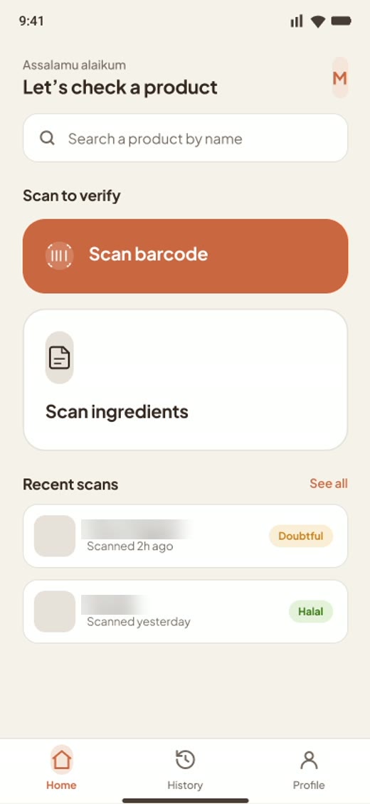
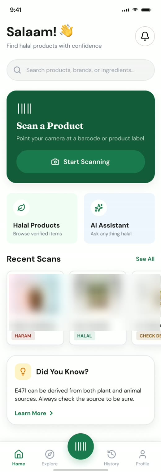
Right at the start, I tested how far vibe coding could go: I asked Claude for a whole halal scanner app in one go. It worked, but it was crowded, messy and green everywhere, like so many vibe-coded apps. I wanted a brand of my own.

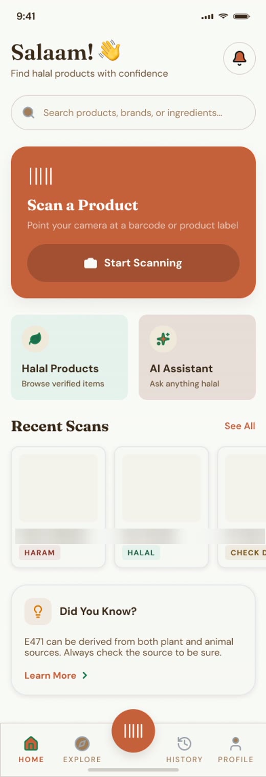
So I taught it my brand. I gave the AI my own brand guidelines. Figma Make produced variations of the home screen, and I kept sending instructions for improvements. Some screens I built in Figma Make and some with Claude, always with one rule: use only my existing design system.

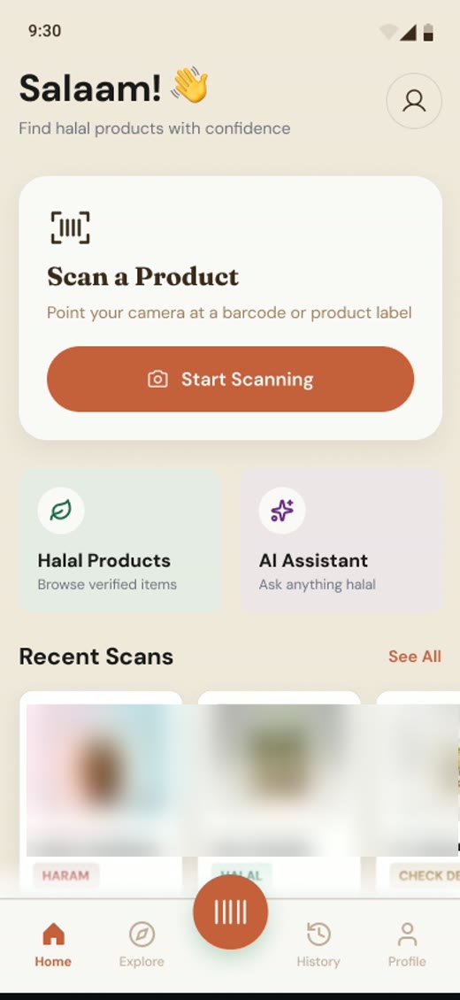
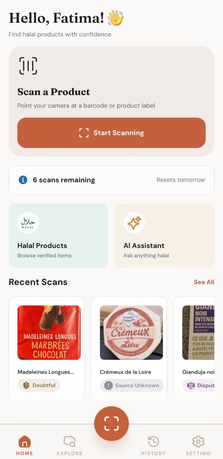
What shipped is a calm home screen built around one action: scan. Green went back to one job, meaning Halal.

Drag the slider. Watch the green leave.

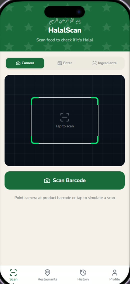
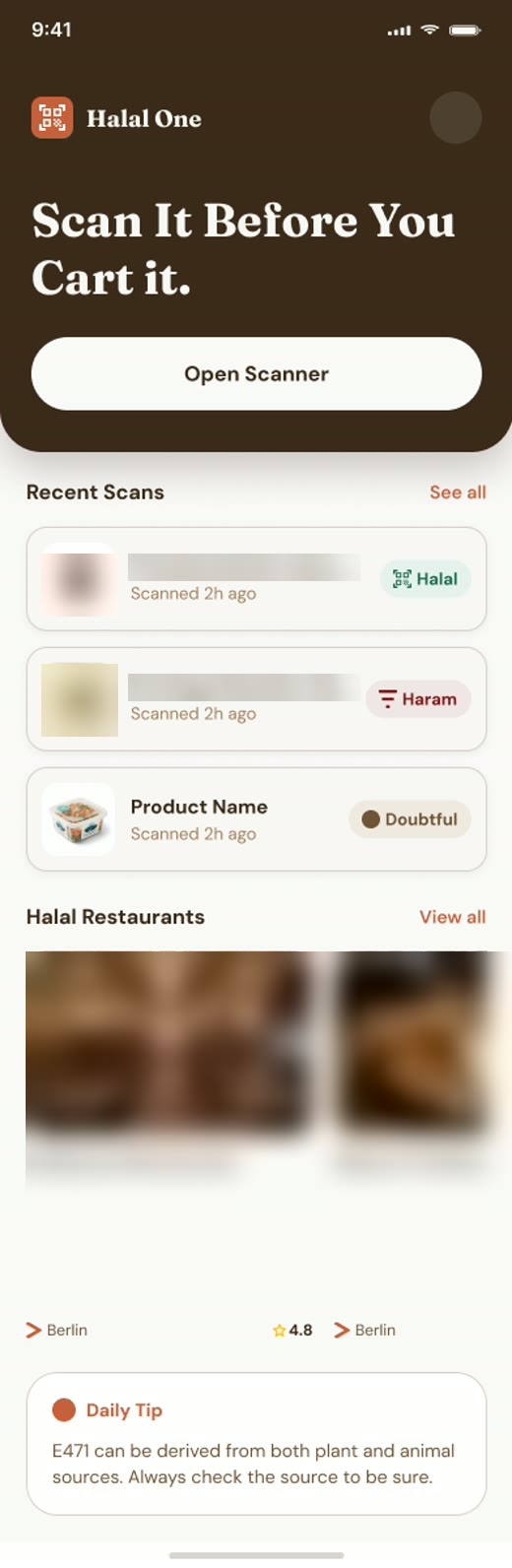
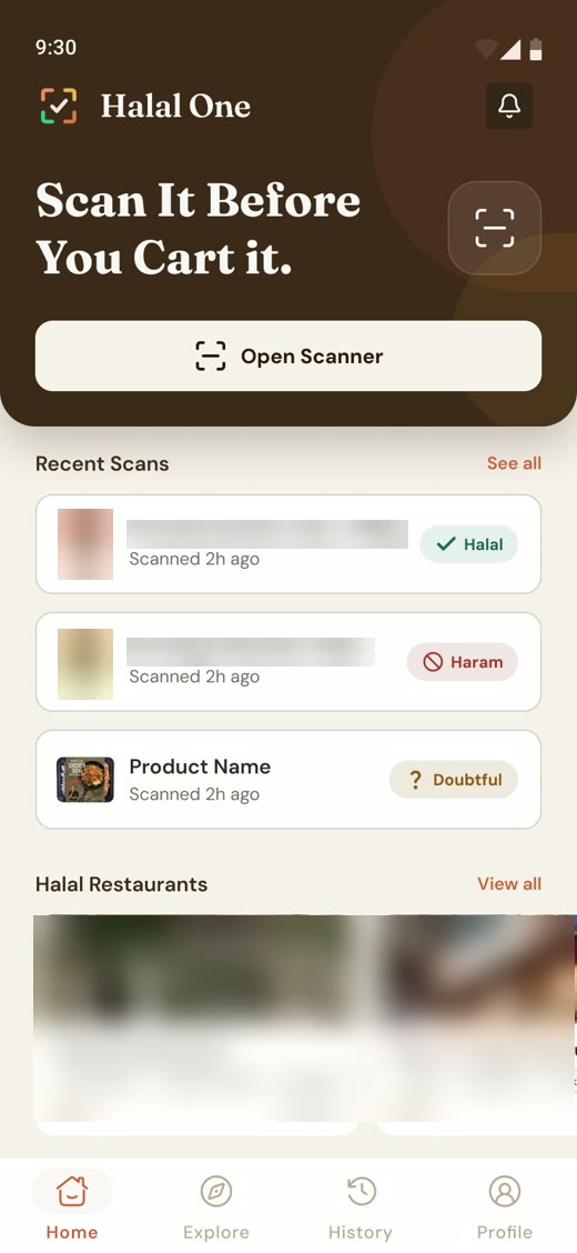
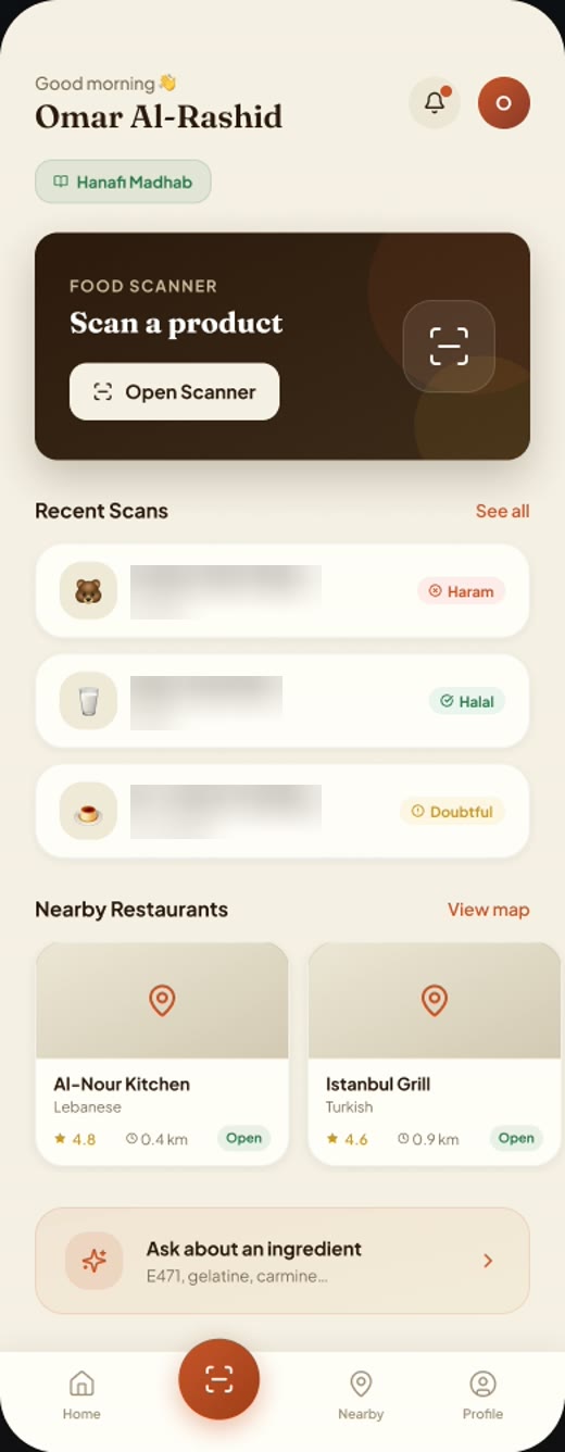
First build: a crowded green scanner screen Figma Make variation with a dark espresso header Figma Make variation with a dark header and a scanner button Figma Make variation with a dark scan card and nearby halal restaurants Figma Make variation with two scan options Figma Make variation with a green scan card Figma Make variation in terracotta Figma Make variation with a calmer card The shipped Halal One home screen, built around Start Scanning

First build

Late July to October 2026

How I built with AI

I have a software engineering degree, but I chose design because I never enjoyed hand coding. So I didn't ask AI to “build my app”. I treated this like a real software company. AI was the team. I gave it its guidelines, its roles and its limits, and I kept control of every decision.

  1. 1

    Research first

    I researched and drafted my prompts in ChatGPT and Gemini, so my Claude usage went on building, not exploring.

  2. 2

    A project with rules

    In Claude, I created a project and wrote how it should respond and how it should work.

  3. 3

    Ten documents

    I created them with Claude as .md files, not PDFs. They are smaller, so every chat uses fewer tokens.

    The ten documents: PRD, Screen Inventory, Architecture Document, Design System Documentation, Feature Specification, Database Schema, API Documentation, Security Architecture, Development Plan and Roadmap.

  4. 4

    The right files for each task

    For the design system, I gave Claude the design system tokens, the implementation guide and my Figma file through MCP, and told it to build the design system in code exactly as it is built in Figma.

  5. 5

    Database

    I gave it the database schema and the feature specification, and told it to act as a senior developer and give me the queries table by table.

    I wanted to know my database inside out, so I created every table in Supabase myself.

  6. 6

    Screens

    I set up the project in VS Code and GitHub. Then I gave Claude the related files and asked only for code that matched the database and the Figma screens. I created the files and added the code myself.

  7. 7

    Nothing without my approval

    Don't implement anything without my approval. First make a plan, and if you have any questions, ask me before you start.

    Don't commit anything to GitHub without my approval.

    Example prompt, not my exact wording

    Nothing gets built until she says yes.

  8. 8

    Test, then Claude Code

    I created a dev environment for unit testing, and tested on my phone with Expo Go. Once the files existed, I moved to Claude Code in VS Code. It reads the project itself, which made fixing bugs and auditing much easier.

    At first I kept Claude Code in manual mode, so I could see every change before it happened. Once I saw it was working to my instructions, I switched it to auto mode.

    She switched it to auto only after it earned it.

  9. 9

    Rebuild

    The results weren't what I had in mind. I researched the ingredients, recreated the database structure in full detail, and rebuilt the database and then the code.

    Wrong result? Back to the drawing board. That's the job.

  10. 10

    The roadmap

    I followed my roadmap the whole way, one step at a time.

Decide, test, change your mind

It never goes exactly the way you plan. I started with a PRD and a database structure. When I tested the app on my phone, the answers didn't match the way I think about ingredients. So I recreated the database structure with every detail I could think of, and rebuilt it.

That is the real work with AI. You make a decision, you see the result, and if it's wrong you change your idea or your assumptions, again and again until the result is what you want. Most of my time went into thinking and solving problems. AI made the implementing faster. It still took time, but far less than building everything by hand.

From then on

How I work with Claude Code

Claude Code writes the code, but it doesn't decide what the product is. The Figma design and the documents do. This is the kind of instruction I gave it for the whole project:

You are working on Halal One. The Figma design and /docs folder are the single source of truth.

Never invent features. Never change architecture without explaining why.

Before coding: 1. Review documentation. 2. Explain implementation approach. 3. Identify risks. 4. Then write code.

Maintain consistency with existing components and database structure.

Example prompt, not my exact wording

The design has to survive the build

The Figma variables became the app's theme file, with the Figma name written beside each value. So a button in the app can be traced back to its token in the design.

  1. In Figma

    button / primary-container#C5603C
  2. In the code

    btnPrimaryBg: '#c5603c', // --button/primary-containerbtnPrimaryLabel: '#faf9f8', // --button/primary-label
  3. On the phone

    The Halal One home screen, with its Start Scanning button in terracotta

The first lines of that file say it plainly: “Single source of truth. Never hardcode colors, spacing, or font sizes in screens.”

Later, when the code needed a clean-up, the rules went in first. Claude Code reads them before it touches anything:

  • Never change behavior.
  • Small batches.
  • Verify before moving on.
  • Preserve all halal-verdict logic exactly.

During development and testing

The AI said. I decided.

In the testing phase, I created test cases and tested the app with them, in Claude Code and by hand. A finished screen can't show whether a designer is good with AI. These moments can.

The snake

During testing, a friend scanned a product and sent me a screenshot. It said HARAM, and the reason was snake in the ingredients. I was 100% sure that was a bug, not a real ingredient.

I sent the screenshot to Claude Code and it found the cause: its fuzzy matching was guessing at words with a similar spelling.

The code fix was the AI's. The rule was mine: a guess can never make a product HARAM. Haram now needs an exact match. Those products now show Scholars Disagree or Doubtful instead.

“intake”Snake
“from”Frog

HARAM

Snake? In food from a supermarket? Press the button, quickly.

The AI

Claude's early warning came true. In testing, the data didn't give the answers I expected. An audit of the database, frontend and backend found a long list of places where the data didn't match my idea of how each ingredient should be judged.

Me

I researched the ingredients again, recreated the database structure in full detail, rebuilt the database, applied the migration and updated the code. It took a lot of my time, and it was the most important work in the project.

The AI

It stretched one button with a one-off style.

Me

One button should stay one button. The fix went into the shared button component as a full-width option.

The AI

Its first security audit came back with a good report. It's easy for AI to mark its own work kindly.

Me

Before Google Play, I asked for a security audit, and one good report was never enough for me. I kept auditing from different angles, and that is how the serious problems were found and fixed before launch.

November 2026

Shipping it

  1. 1

    Deploy

    I deployed on Railway with two environments: staging for testing, and production for real users.

    I made the builds on Expo.

    • Railway
    • Expo
    • Staging
    • Production
  2. 2

    Security checks and audit

    Before launch I ran security checks and audits.

    I wrote a checklist for the Play Store and audited the whole app against it.

  3. 3

    Closed testing

    20 testers, my family and friends in Germany, Australia and Pakistan, used the app in closed testing.

    They scanned products I would never have picked, which is exactly how the snake appeared.

    • Germany
    • Australia
    • Pakistan
  4. 4

    Live on Google Play

    I made the store assets in Figma, and the images with Stitch.

    • Figma
    • Stitch
    • Google Play

20 testers, 3 countries, one snake. Worth every scan.

Halal One went live on Google Play in November 2026.

It is free and has no ads.

Now

What I'd tell you

AI won't replace the person who directs it. It works only as well as the guidelines, roles and checks you give it.

I took my own product from the first idea to real people's phones, directing AI the whole way.

Next on the roadmap: scan ingredients and halal restaurants nearby.

AI builds fast. I decide what's right.

Your turn. Scan something.